 I am very excited to bring you this next set of color combinations from images – vintage inspired color palettes. This time, the color schemes are all based on digital reproductions of vintage postcards, old advertising trade cards, and prints from antique books, all courtesy of TheGraphicsFairy.com. This set includes:
-
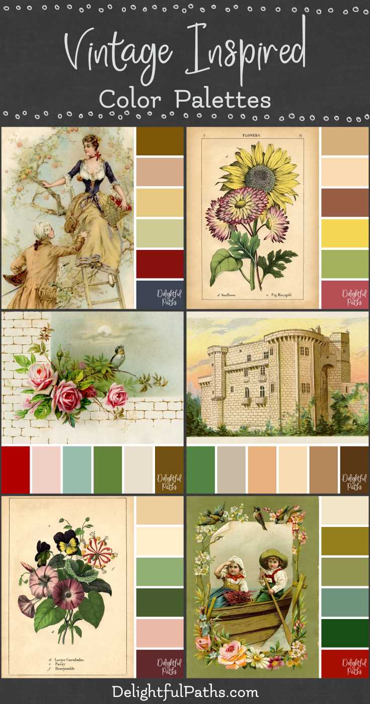
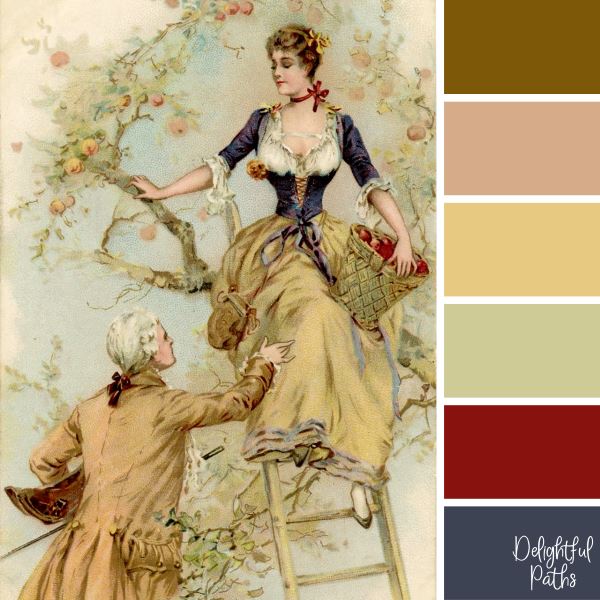
Man and Lady Picking Apples
-
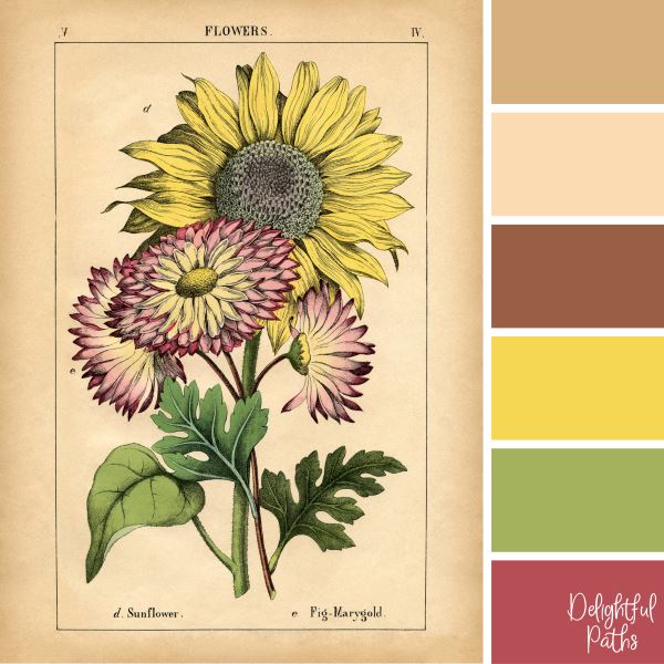
Sunflower and Pink Flowers
-
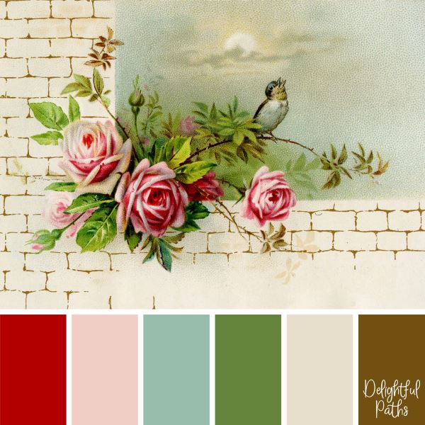
Vintage Roses on a Wall
-
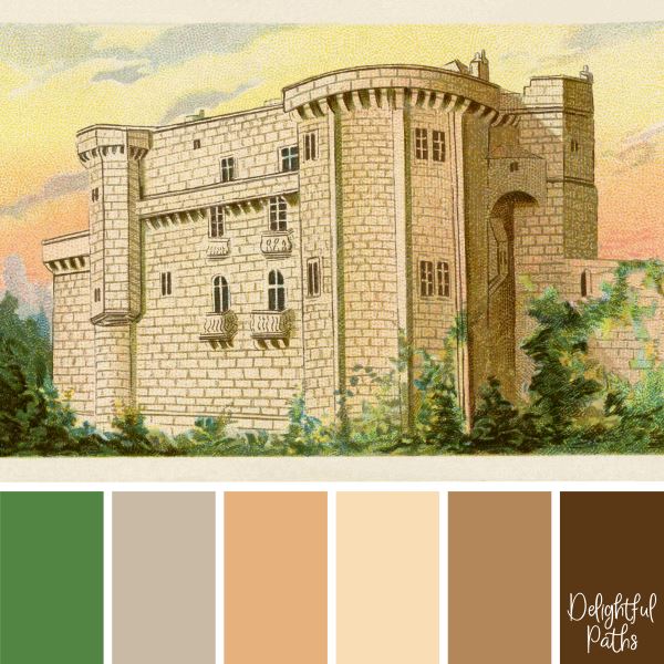
Old Castle in the Sunset
-
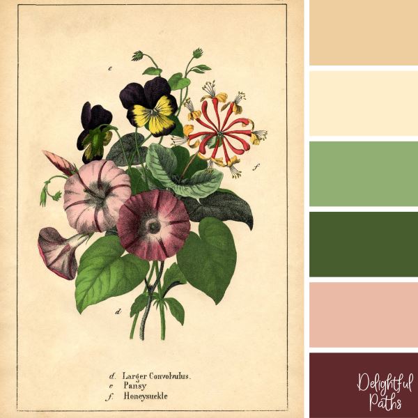
Morning Glories, Pansies, and Honeysuckle Bouquet
-
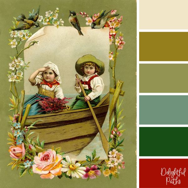
Children in a Boat with Floral Border
The palettes in this set consist of creams, yellows, browns (often from pages yellowed with age) as well as a variety of other hues, including greens, reds, pinks, and blues.
Vintage Inspired Color Palettes
Man and Lady Picking Apples
Sunflower and Pink Flowers
Vintage Roses on a Wall
Old Castle in the Sunset
Morning Glories, Pansies, and Honeysuckle Bouquet
Children in a Boat with Floral Border
I have more color palettes (many from images) to inspire your artwork and coloring. You can also visit my pinterest page to see all the color schemes in one place.
What will you use these palettes for?
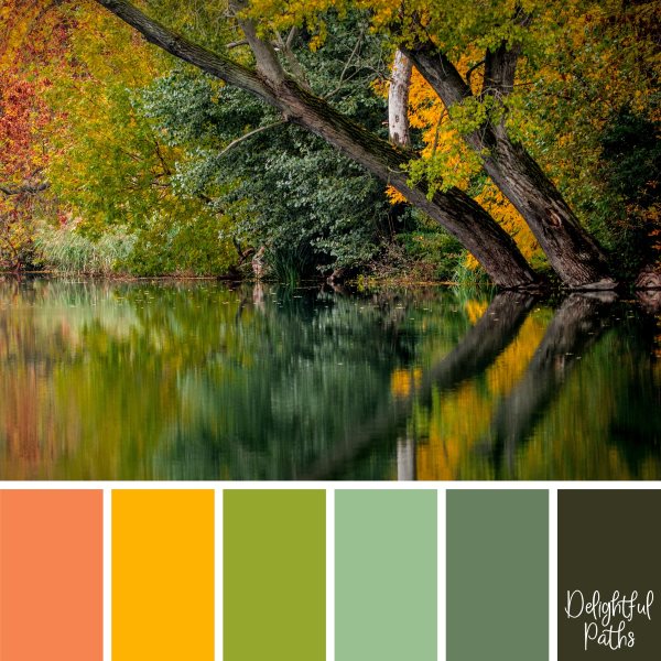
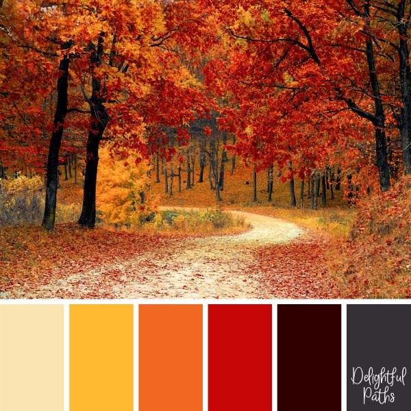
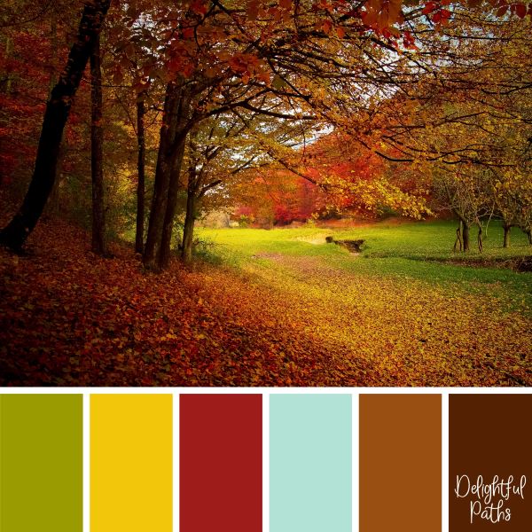
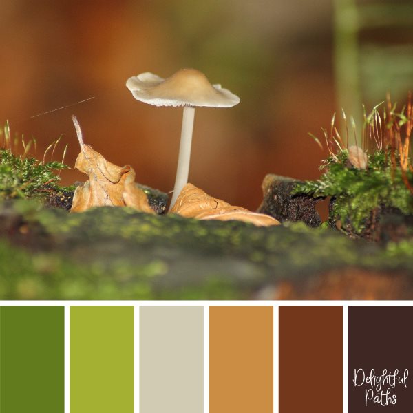
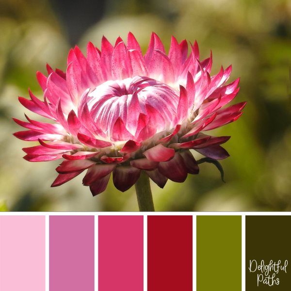
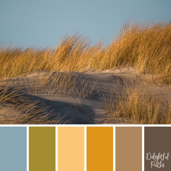
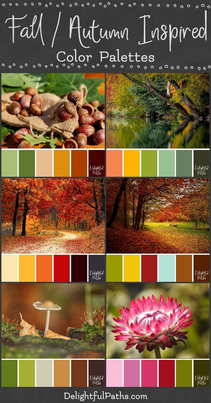 Here is your next set of color schemes from images: Fall / Autumn inspired color palettes. These vibrant color palettes use photographs of Fall (or Autumn as we say here in Australia) scenes as inspiration. This set includes:
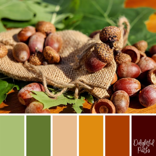
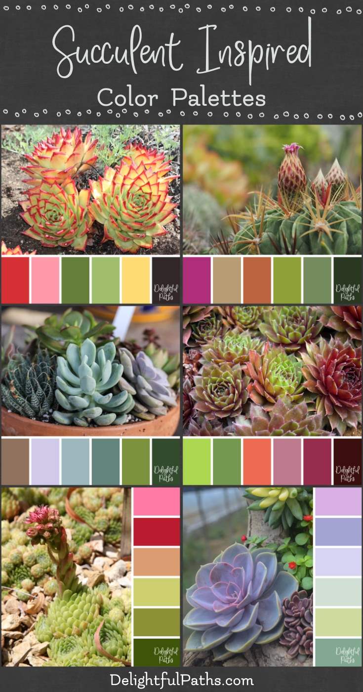 I love creating color palettes from images. This time, I have some succulent inspired color palettes. These colorful color schemes use photographs of succulents as inspiration. All of the photos but one in this set come from pixabay.com (one is my own). This set includes:


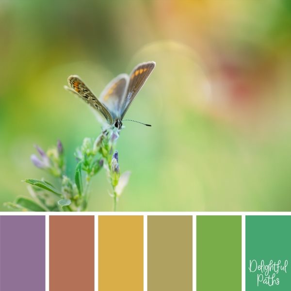
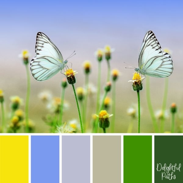
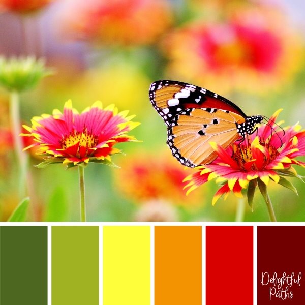
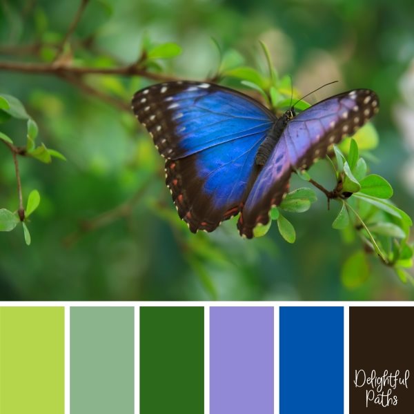
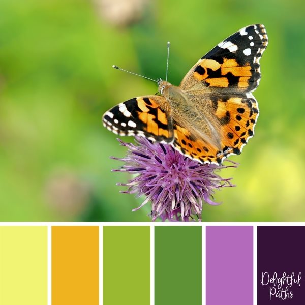
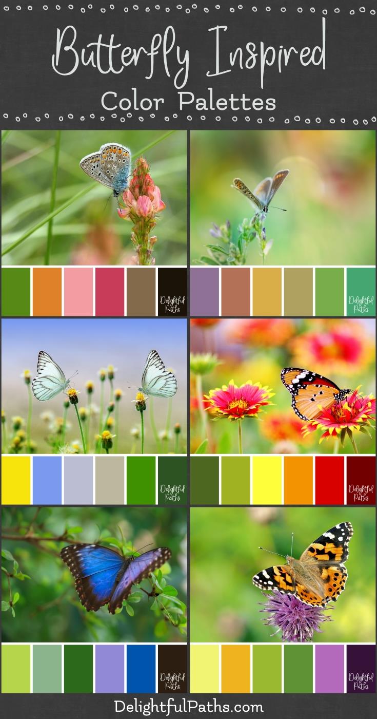 I am continuing my series of color palette posts using photographs from various themes as inspiration. This set contains some bright butterfly inspired color palettes. These color schemes are inspired by a series of butterfly and flower theme photos (courtesy of pixabay.com).
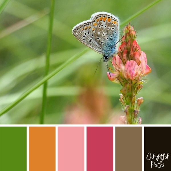
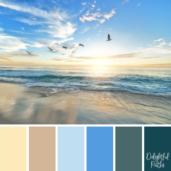
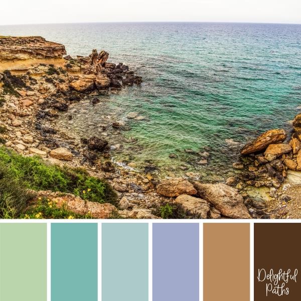
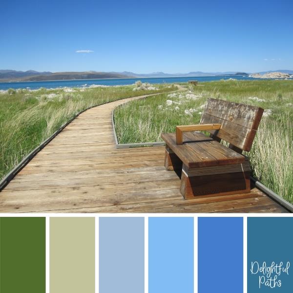
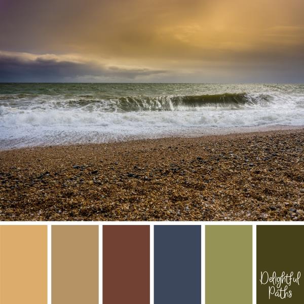
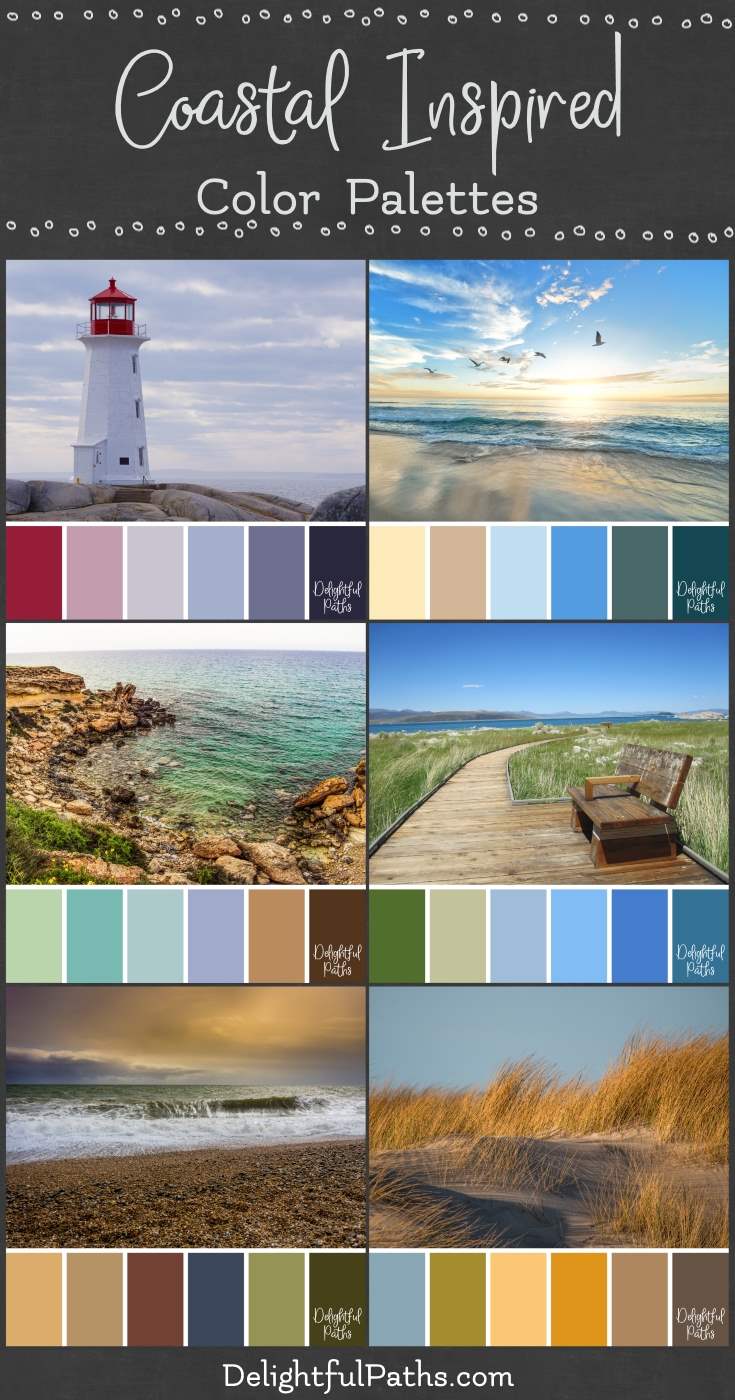 I am starting a new series of color palette posts using photos from various themes as inspiration. The first set contains some beautiful coastal inspired color palettes. These color schemes are inspired by a set of sea and ocean theme photos (courtesy of pixabay.com).
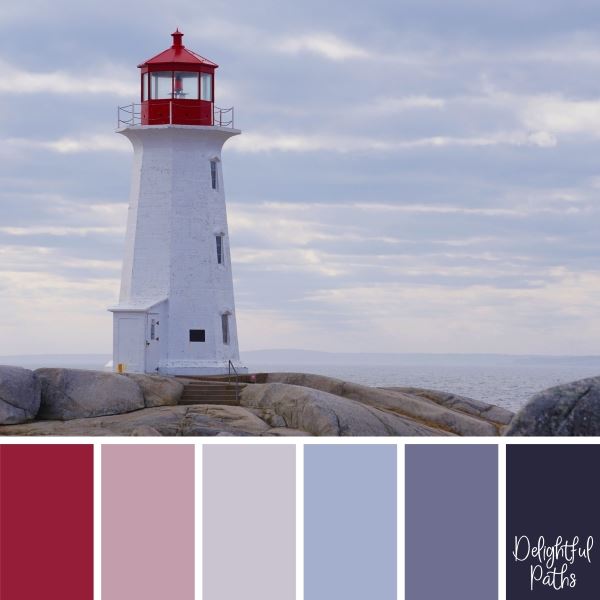
 My monochromatic card was done in different shades, tones and tints of blue. This card kind of reminds me of delft pottery (a bit of my Dutch heritage showing there).
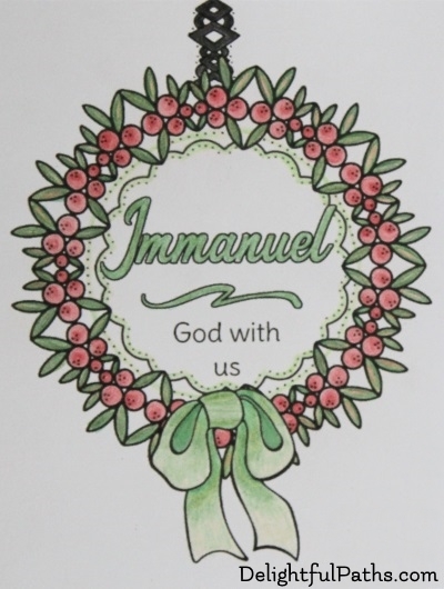 My complementary palette consisted of red and green. I tried using the red to create some of the shading on the bow.
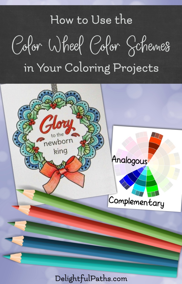
 I used an analogous palette of four cool colors (willow green, green, turquoise, and blue) when coloring this Christmas card.
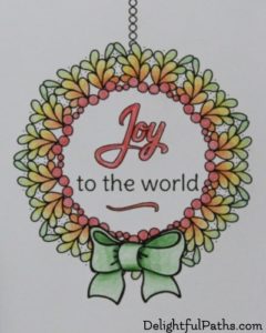 I used the split analogous palette for this sample. I decided to use primary and secondary colors: red, orange, yellow, and green.
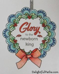 This card is colored using one of my favorite palettes, an analogous complementary palette of blue, turquoise, green, willow green with a vibrant contrast of red. My Staedtler pencils do not have an orange / red so I blended a little orange into the red to make it a more true complementary to the turquoise.
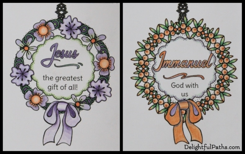 Here are two cards colored using the same triadic palette. I used the secondary colors: violet, orange, and green for both. The dominant or mother color in the first card is violet and in the second, it is orange. This shows how different even the one color palette can appear, depending on the proportion of each color.
 My rectangular tetradic sample has the four colors: blue, orange, green, and red.
 The square tetradic palette used in this card consists of dark mauve, willow green, blue and brown (a shade of orange).