Would you like to know how to use the color wheel color schemes in your coloring projects? In my previous post we learned about choosing a color palette based on the color wheel (such as the monochromatic, complementary, or analogous palettes). But are you finding it hard to imagine what these will look like in your coloring books and crafts?
This post will show some artist’s color palettes in practice in some real coloring projects. I am including pictures of some Christmas cards I colored using the different color combinations. This will help you to get an idea of how the colors can work together.
Using The Color Wheel Color Schemes in Your Coloring Projects
I colored these cards using my pack of 24 Staedtler Ergo Soft pencils so I had a limited number of colors to choose from. Because I had to be reasonably quick making 50 or so cards (why do I always leave things to the last minute?!), I have done very little blending.
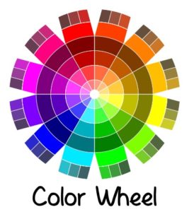
In preparation for using the different color schemes, I made a rough color wheel and judged by eye which pencils were in which position on the color wheel.
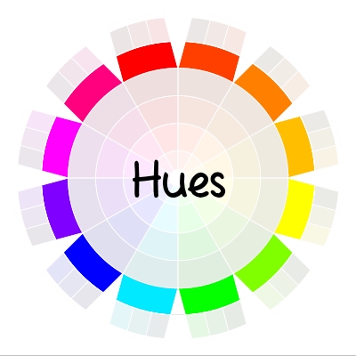
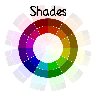
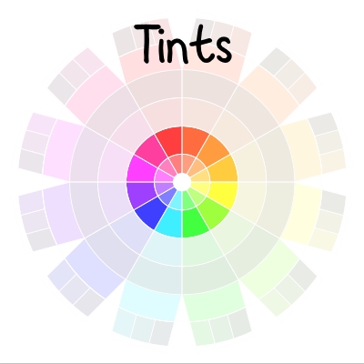
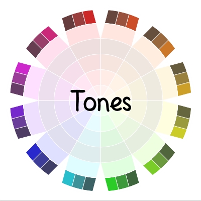
Don’t forget that you can use the different shades, tints, and tones. If you are using pencils, coloring using less pressure will result in a lighter tint. On the other hand, to get a darker shade, press more firmly and make sure your pencil has a good sharp point.
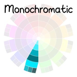
1. Monochromatic Color Scheme
 My monochromatic card was done in different shades, tones and tints of blue. This card kind of reminds me of delft pottery (a bit of my Dutch heritage showing there).
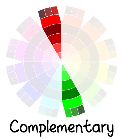
2. Complementary Color Scheme
 My complementary palette consisted of red and green. I tried using the red to create some of the shading on the bow.
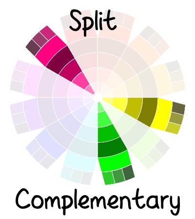
3. Split Complementary Color Scheme
Okay. So I’ve been caught out! I found that the Christmas cards I had photographed for this color scheme were not actually done with my staedtler pencils but with my prismacolor pencils (and I have 150 of those to choose from!) So I will be uploading a picture of a card, once I’ve completed it, using the colors turquoise, willow green and red.
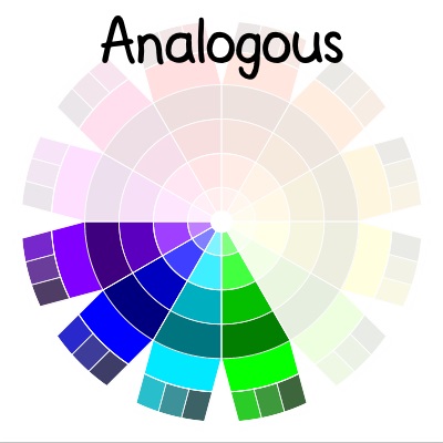
4. Analogous Color Scheme
 I used an analogous palette of four cool colors (willow green, green, turquoise, and blue) when coloring this Christmas card.
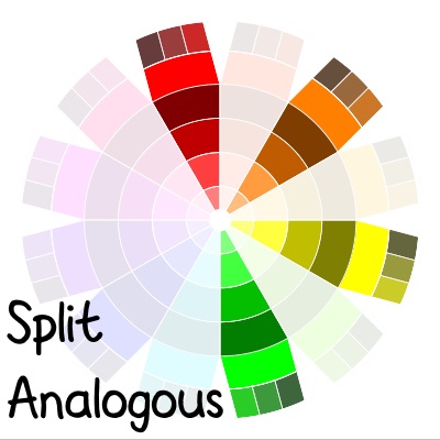
4b. Split Analogous Color Scheme
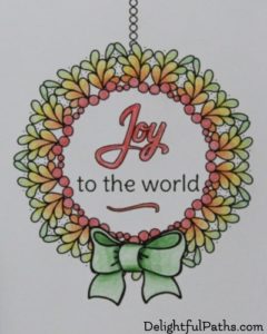 I used the split analogous palette for this sample. I decided to use primary and secondary colors: red, orange, yellow, and green.
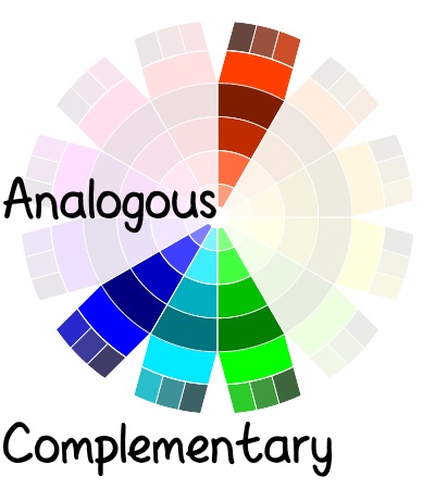
4c. Analogous Complementary Color Scheme
 This card is colored using one of my favorite palettes, an analogous complementary palette of blue, turquoise, green, willow green with a vibrant contrast of red. My Staedtler pencils do not have an orange / red so I blended a little orange into the red to make it a more true complementary to the turquoise.
5. Triadic Color Scheme
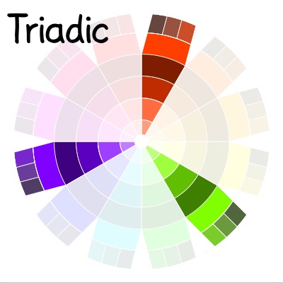
 Here are two cards colored using the same triadic palette. I used the secondary colors: violet, orange, and green for both. The dominant or mother color in the first card is violet and in the second, it is orange. This shows how different even the one color palette can appear, depending on the proportion of each color.
6. Rectangular Tetradic Color Scheme
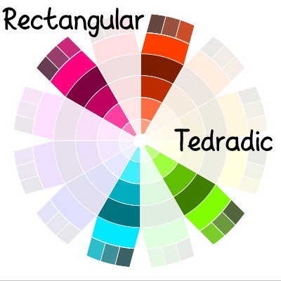
 My rectangular tetradic sample has the four colors: blue, orange, green, and red.
6b. Square Tetradic Color Scheme
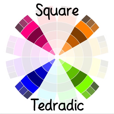
 The square tetradic palette used in this card consists of dark mauve, willow green, blue and brown (a shade of orange).
Variations
Don’t forget that there are more variations for each palette than what I am showing you here. Starting at a different position on the color wheel will give you a different set of colors to work with.
You will also get a very different look by using the same set of colors but using a different one as the dominant color.
So there you have it – some real life examples of projects using the color wheel color schemes. And these were all done using a set of 24 pencils. If you have a different brand of pencils, you may have a different selection of colors and so your palettes may be different from mine. Let me know what you come up with.
 Do you have problems with choosing a great color palette with colors which work well together? Do you continue to use the same color combinations over and over again, lacking the confidence to try something new?