 Do you have problems with choosing a great color palette with colors which work well together? Do you continue to use the same color combinations over and over again, lacking the confidence to try something new?
When I first got into coloring about one and a half years ago, before learning about color theory, it was not uncommon for me to start coloring a picture, only to decide that I didn’t like the color combinations. The first few times I tried using my eraser to get rid of the ugly bit, but I usually only succeeded in smudging the color and dragging it outside the lines. So I would take out a different pencil and try to color over the top of the offending section. Sometimes that worked and sometimes it didn’t. And you know what? There’s only so many times that you can layer pencil upon pencil. After a couple of layers, the color didn’t stick to the paper any more and I just succeeded in getting a muddy-looking mess.
Since then, I have discovered that there is a bit of science to choosing your color palette for your picture or craft. Have you ever seen a photo or piece of art where the colors just seem to work? I have an auntie who regularly makes gorgeous patchwork quilts and the color combinations always just seem to work. So how do you choose a color combination or palette that “works” and looks pleasing to the eye? To find out, we need to look at a bit of color theory.
At school I only learned the basics of color theory: red, yellow, and blue are the primary colors and when you mix any two, you get secondary colors:
- red + yellow = orange
- red + blue = purple
- blue + yellow = green
I have discovered that to see which color combinations are effective, we have to learn a little bit more than I did at school. So come with me and let me share with you what I have been learning.
Basic Color Theory
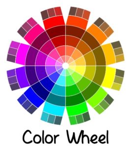
The color wheel is a way of showing how different colors relate to each other.
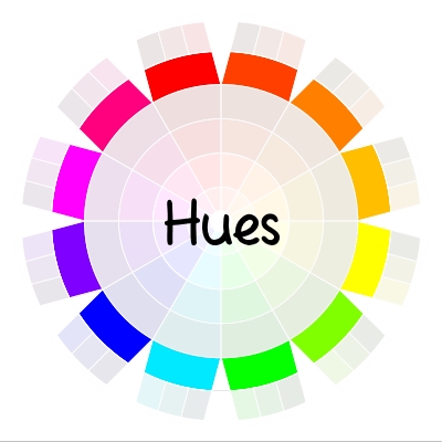
A hue is the pure form of a color.
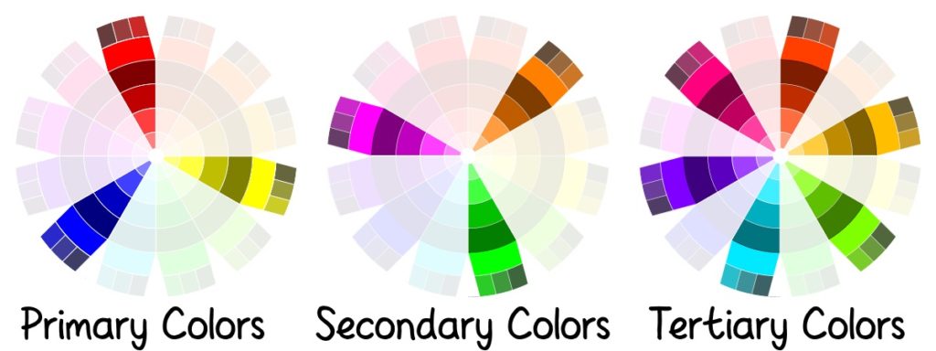
Most artist color wheels have twelve basic hues shown (like the one above), with three primary, three secondary and six tertiary colors or hues. Notice how the primary colors are evenly spaced around the wheel. The secondary colors are also evenly spaced around the wheel. The tertiary colors are a mixture of a primary and a secondary color.
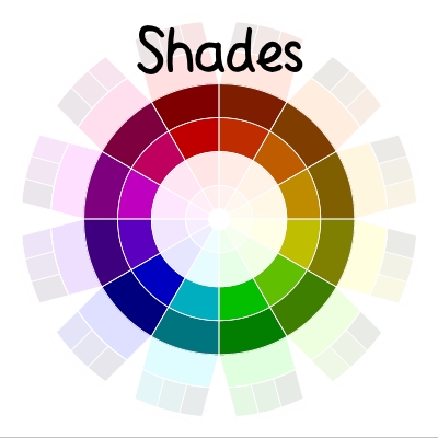
Adding varying amounts of black to your basic hue will give you different shades.
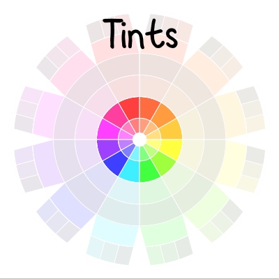
When you add white in varying amounts you will get different tints.
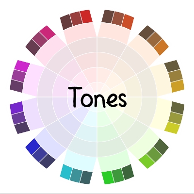
Adding gray will give you different tones.
So now – on to the fun part. Here are six (well, nine actually, if you count the variations) techniques for choosing color combinations or palettes which artists have used for many years.
6 Color Combining Techniques from the Color Wheel
1. Monochromatic Color Scheme
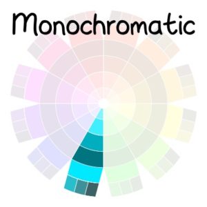
The monochromatic palette is clean and simple and consists of one hue in varying tones, shades, and tints. These colors will always go well together, giving a sense of unity, but nothing will really “pop”. In my example above, I have shown the blue-green hue with some of its tints, shades and tones.
2. Complementary Color Scheme
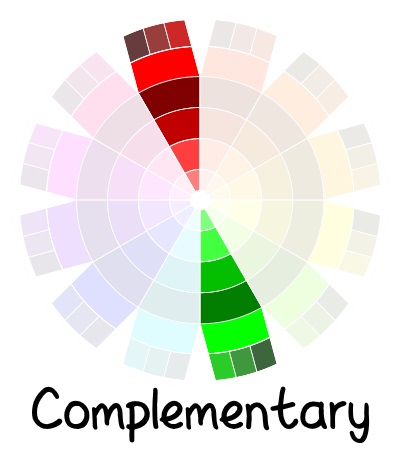
The complementary palette consists of two colors which are exactly opposite each other on the color wheel (eg red and green or orange and blue). These two colors in their pure form make a strong contrast. It seems to work best when you use one of these colors (along with its tints, shades, and tones) as the dominant color in your work and the other for accents.
3. Split Complementary Color Scheme
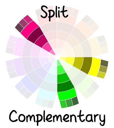
The split complementary palette is a variation on the standard complementary palette. It consists of a color and the two colors adjacent to its complementary.
4. Analogous Color Scheme
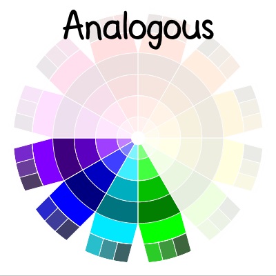
The analogous palette is made up of hues which are next to each other on the color wheel. Unlike the complementary schemes, this one does not have a strong color contrast so everything seems to gently blend together. This is often found in nature. You can use three, four, or five adjacent hues.
4b. Split Analogous Color Scheme
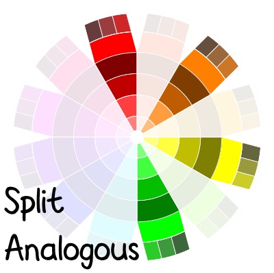
A variation on the standard analogous is the split analogous, where you use two, three, or four hues which are two steps apart on the color wheel.
4c. Analogous Complementary Color Scheme
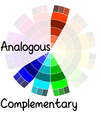
The analogous complementary palette is made up of a pair of complementary colors and two or three of the hues adjacent to one of these.
5. Triadic Color Scheme
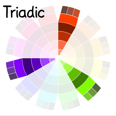
The triadic palette is made up of three colors evenly spaced around the color wheel. Because of this even spacing, this palette tends to be quite vibrant. This can seem rather overpowering if you use the pure hues. So it may be best to use only one color in its pure form and use tints, shades, or tones of the other two.
6. Rectangular Tetradic Color Scheme
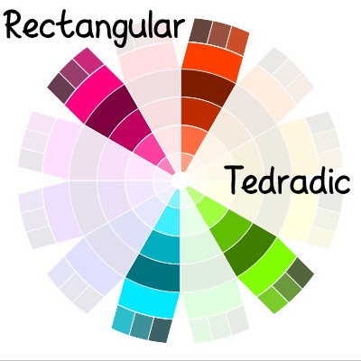
The rectangular tetradic (or double complementary) palette is made up of four colors – two colors either one, two or three steps apart with their complementaries.
6b. Square Tetradic Color Scheme
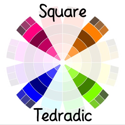
The square tetradic palette is vaiation of the rectangular tetrad being made up of four colors which are evenly spaced around the color wheel. Choose your main color then work your way around the color wheel choosing every third hue, making a square.
How To Choose Your Own Color Palette
To start making a new color palette, take your set of pencils, pens, or markers and draw yourself a color wheel. Start by adding the primary colors, then the secondary and finally the tertiary. In my set of 24 Staedtler Ergo Soft pencils, I found that I didn’t have all the tertiary colors. If you are missing some tertiary colors like me, you can make them up by blending the two colors on either side of it on the color wheel or just skip the palettes that use that color all together.
Take the time to experiment with some of these different palettes. Remember that I have only shown one of each of the different color schemes so don’t forget to look at the other combinations. Also feel free to use any tints, shades or tones of a particular hue to get the effect you want.
It’s fun to get your color palette from nature or a photograph (and I will be showing you how you can do this in a later post), but this works best if you have a large range of colors in your pencils, pens, or markers from which to choose. So if you have just a limited range of colors, you will find it a lot harder to match these sophisticated palettes.
My favorite palette is the analogous complementary because it is a lovely, harmonious palette with a vibrant splash of contrast. Which of these palettes have you experimented with in your coloring?
Thank you for your time and effort posting this easy to understand Basic Colour Theory. I have saved this and now that I am 74 (an old chook lol) and have time on my hands, I am going back to doing arty farty stuff which I haven’t done for years. I decided to try Adult colouring books and am enjoying the journey, still lots to learn … starting with the Colour Wheel. Hugs from Elise Mitton, Melbourne, Australia.
Thanks for your encouragement Elise. Great to renew your artistic hobby. Hope you continue to enjoy your journey 🙂