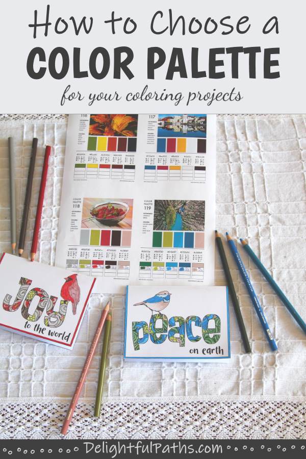
Choosing a color palette can be tricky.
Have you ever looked at your finished pictures and thought, “Meh” or even “Yuck” because your color choice was not quite right, or worse still, all wrong?
Do you find yourself using the same color scheme over and over again because it’s the only one you know that works?
Do you often start coloring with one color and then spend ages fiddling around trying to decide what colors will actually go with it?
If you want to
- take out the guess work when choosing a color palette for coloring books and crafts
- find a palette to match with an existing color
- find a color combination to match a particular theme
then The Color Catalog might be just what you’re looking for.
Please note – this post contains affiliate links which means if you purchase through my link, you pay nothing more, but I will receive a small commission. Thank you 🙂
What is the Color Catalog?
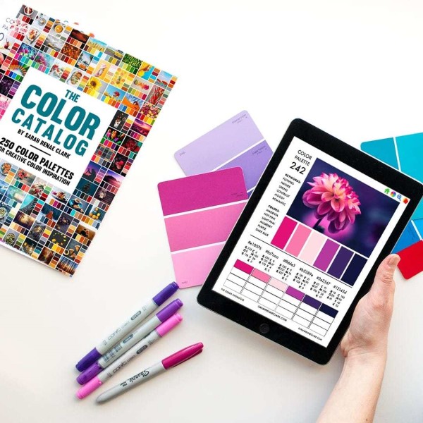
The Color Catalog by Sarah Renae Clark is a large collection of color palettes inspired by beautiful photos from nature and the world around us. They are all contained in an interactive PDF which you can easily click around in on your mobile device or desktop computer. You can even print it out.
The Color Catalog is very useful when you are choosing a color palette for a project that you want to color. But you can also use The Color Catalog if you are selecting colors for:
- a patchwork quilt
- an embroidery
- a website
- decorating your home
- your wardrobe
I have been fortunate enough to receive a review copy of the The Color Catalog. I am delighted to give it a big thumbs up!
Choosing a color palette using the Color Catalog
The Color Catalog is very easy to use.
Start with a color
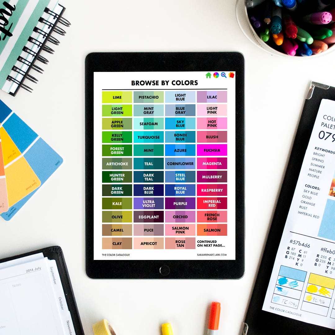
If you want to use a particular color, click on the color wheel symbol at the top right of any page in the Color Catalog and you go to a page where you see a whole lot of different colors for you to choose from. Not all the available color options fit on one page but they are continued on the next page. So just scroll down to the next page to see more. There are many, many colors in here!
Look through the list of colors and choose one. For example, you may want to use crimson to color a cardinal. When you click on the button that says crimson, you’ll jump to another page which shows all the color palettes that have a variation of crimson in them. They’re not all exactly the same hue but they’re all very similar. Then you will be able choose a thumbnail that you like from among those crimson color palettes.
Click on the thumbnail of the picture that you choose and you’ll be taken to a new page which has the picture in full size along with the color swatches. Underneath those color swatches you will be given all the different numbers. These are the hex numbers for web colors in HTML (eg #ff0084), RGB values for on-screen colors, and CMYK values for printing. You can print out this page, but bear in mind that the color may not be exactly the same when you print it. (I had to fiddle with some of the controls for my printer to have it print more like what I was seeing on the screen. But if you want to do this, you will need to check your printer’s documentation, as it will be different for every printer.)
Start with a keyword (or theme)
You are not limited to only choosing your palettes by starting with a color. You can also get inspiration from different photos by looking at the keywords. Go to the list of keywords by clicking on the magnifying glass at the top of the page.
If you want to choose pencils or markers for a project to be used for a baby shower, you can check out the palettes with the keyword pastel.
For a child’s birthday party invitations, you can check out the palettes with the keyword bright.
Start with a collection
Finally, you can also search The Color Catalog by collection as featured on Sarah’s website. I don’t see myself using this option often, but it is there if you would like it.
See the Color Catalog in action
An example showing how I used this great resource
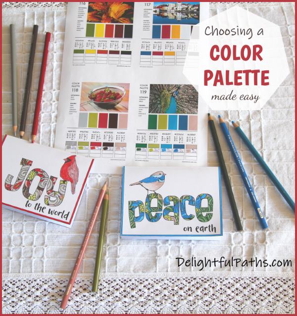
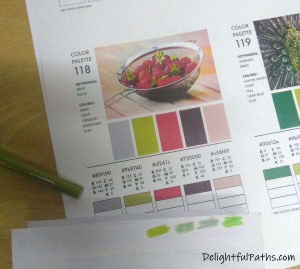
I wanted to color a couple of Christmas cards which I just designed. So I found a palette with crimson in it for the cardinal. I printed out that palette (#118) as well as 3 others (4 to the page). Then I went through my primacolor premier colored pencils, choosing pencils that looked as though they might match. I colored a piece of scrap paper, holding it next to the swatches on the printout. Then I chose the one which I thought matched the best.
I colored little patches on the printout and wrote the pencil number in the box.
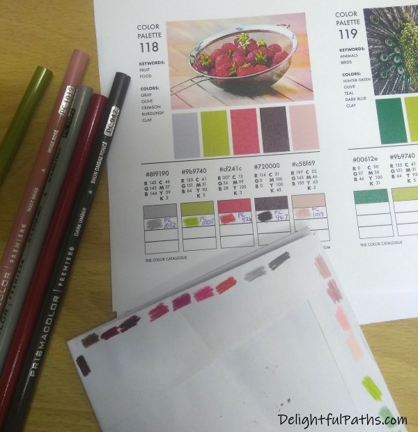
I also recorded the best pencils for the peacock palette #119.
Then it was simply a matter of using the five pencils in each palette to color each card. I was very happy with the results, particularly as I don’t think I’ve used those color combinations in a project before.
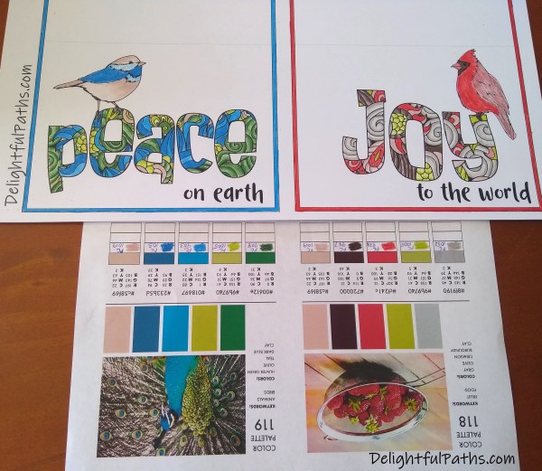
If you’d like to try these cards yourself, you can access the Christmas cards in my free resource library.


I used these prismacolor premier pencils for these cards:
Peace – PC908, PC1005, PC903, PC103, PC1019
Joy – PC1052, PC1005, PC924, PC947, PC1019
Final thoughts on the Color Catalog
The Color Catalog contains inspirational pictures as well as 250 color combinations. You are not likely to get bored with this! Sarah has chosen such stunning photos, that I love just browsing through the book 🙂
And of course, this resource will make choosing a color palette for your next project so much easier! So if you struggle with choosing a color scheme, why not take a look at this great resource. I am looking forward to exploring this resource more and coloring more projects with the different color combos.
You can find out more information here: The Color Catalog by Sarah Renae Clark. (affiliate link)
Check it out and let me know what you think 🙂
Pin to Pinterest to read this later
Leave a Reply